
18 Entrepreneurs Share Great Advice From Their Fathers
June 16, 2016
The Impact Of New Top Level Domains
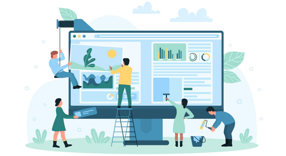
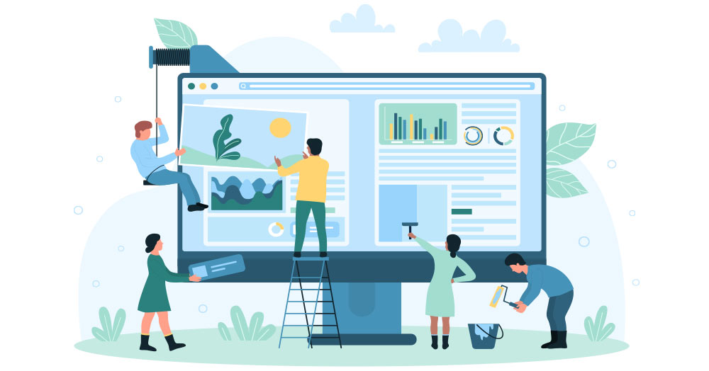
August 24, 2016How To Avoid Overwhelming Website Visitors

Imagine for a moment that a prospective client walks into your office and asks how you can help them succeed. Rather than providing a quick summary of your products or services, you instead point them towards a wall full of filing cabinets and say, “Please feel free to look through everything over there and, if you have any questions, don’t hesitate to ask!”
Is your website the digital equivalent of a filing cabinet? People are impatient, even more so when online, so here’s how to avoid overwhelming and, ultimately, losing website visitors.
State Your Purpose
Immediately, your website should convey the following:
- What you do
- Who you service/sell to
- How you’re unique or special
- Why they should use you
This is a critical starting point for any website. If someone can’t size you up within the first 5 seconds, they’re likely to move on to another website.
Start With The Cliffs Notes
Your website might very well be head and shoulders above your competition. In fact, it could be the complete, authoritative guide to your industry. And, when your prospects read it from start to finish, they’ll know just how great you really are.
There’s just one little problem. That’s never going to happen. Your website isn’t a book.
Remember those abbreviated versions of books that many – err, some – of us used in high school to avoid reading those lengthy novels? Cliffs Notes were so popular because they provided a succinct recap of a story in a quick reference guide format. While your high school teacher may have considered that cheating, your website visitors will appreciate it.
Of course, some organizations or industries simply require a more verbose website, and that’s all right. You can still start with the Cliffs Notes approach, then allow your visitors to access more information if they choose. The key is to determine the optimal sequence for visitors to consume your information, so that they can decide how much, or how little, they want.
- Begin as small as possible, offering bite-sized information
- Next, give some details, but only the most vital and keep it concise
- Additional information, if necessary, can be located in ancillary areas (FAQ, Blog, Videos, etc.)
Break Up The Text
Regardless of how good the content is, lengthy pages of text will quickly overwhelm many website visitors. Here are some ideas for breaking up all that copy:
- Videos or Infographics: Most people are visual learners, so make sure you offer content that appeals to them.
- Photographs: The right image can connect the visitor to your content.
- Headings & Pull Quotes: Large fonts will catch the reader’s eye. Make sure you break up your text into logical sections. You can also highlight significant text within the copy or off to the side.
- Pagination: Begin by offering part of the content, then allowing the visitor to choose whether they want to continue. If your content spans many pages, you should still include a way of viewing it as one single page, but let the visitor decide their preference.
Today’s world is full of informational and cognitive overload. Your website needs to cut through that and provide a clear, focused and engaging experience for your visitors.


