
The Marketing Results Triangle: Message, Media, Market
August 6, 2021
The Power of Simplicity in Marketing
August 17, 20213 Foolproof Ways to Create a Great Company Logo
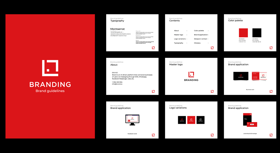
Have you taken a close look at your company logo lately? Does it look like it came straight out of the 1970s, or have you kept it up-to-date? An outdated logo can make you look stagnant and stale in the minds of prospective customers. To combat this effect, many companies redesign their logos every so often to keep them fresh. If your company is considering a logo update, here are some tips to help:
1. Consider How It Will Be Viewed
Choose a logo that looks good large or small. This will allow for more variety in your ads and other printed materials. Avoid small type and overly-wordy taglines.
2. Simplicity Is The Key
Keep it simple. Your logo doesn’t have to look fancy to grab attention. Just look at IBM and Apple. Their logos are simple but memorable.
3. Don’t Go Overboard With Color
Limit yourself to two or three colors of ink. Having too many ink colors in your company’s logo will put an unnecessary strain on your printing budget – and might actually look distracting, rather than distinctive. A nice-looking, two-color logo will give you the professional look you want at a reasonable price.
For more great logo ideas, take a look at our logo design portfolio.
We can help you develop a distinctive logo at an affordable price. Or if you already have a logo in mind, we can show you how to use it more effectively on your printing.


