
Mailing Lists: Connecting With the Right People
January 19, 2022
QR Codes: Bridging the Gap Between Print and Digital Marketing
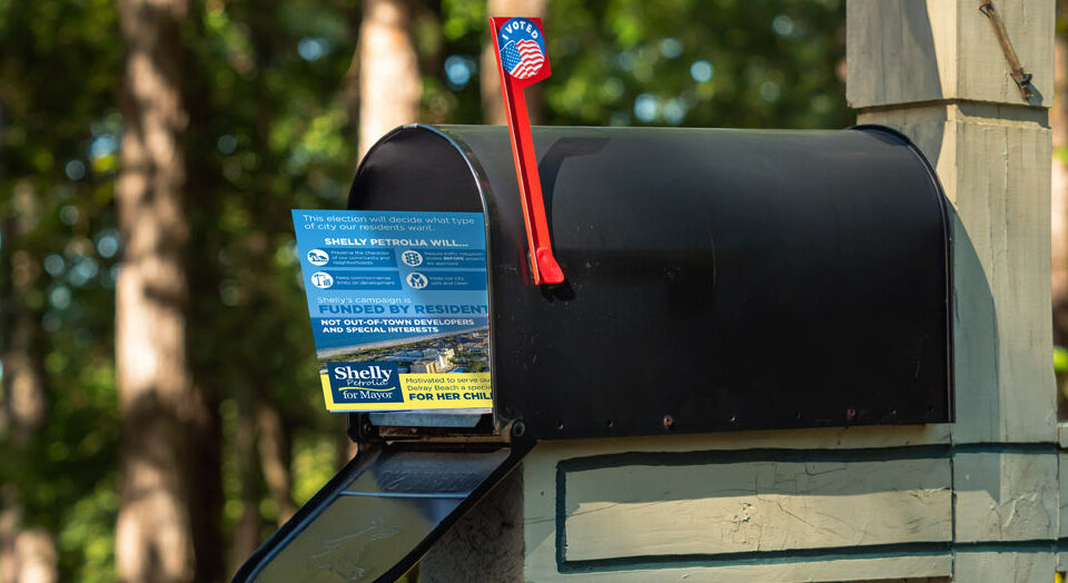
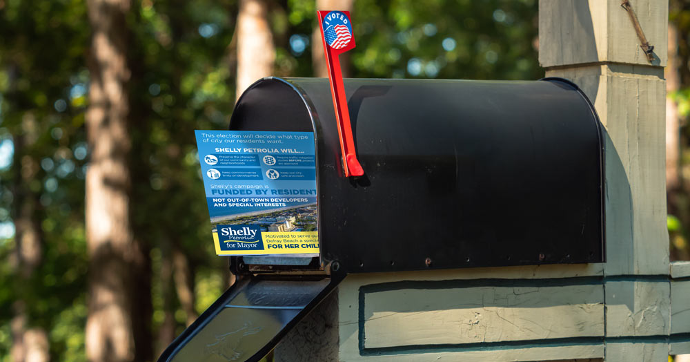
February 8, 2022Creating A Great Political Logo
Whether you’re new to politics or have been in the game for years, you probably understand how important visual elements can be to a campaign. Policy proposals are certainly key, but logos and pictures connect with voters on a more direct level. By associating your campaign with a fresh, impactful image, you can cement your candidacy into the minds of the electorate. A smart, snappy logo is often the difference between failure and success.
The problem is that creating a great political logo is far from easy. Even big-name candidates with millions of dollars at their disposal often fall short. All the same, you can increase your chances of success by studying successful images from the past, learning about the main elements of a political logo, and keeping up with the latest trends. Armed with useful and relevant information, you’ll be ready to create the image that best suits your campaign.
The Main Goals of a Political Logo
A political logo will never win an election on its own. The image is only meant to serve as an accessory to a broader campaign. What a logo can do is give your candidacy the visual backing it needs to remain relevant among the voting public. Images are powerful tools, and people often find them more memorable than words or ideas. Not everyone in your community will read about your policy proposals, but they’ll all see your logo. By creating an image that’s sharp and memorable, you’ll give a wide swath of the public a general notion of your campaign.
Be Recognizable
First and foremost, you need your political logo to stand out. People see countless logos and symbols on a daily basis. Amid all the clutter, you need your political brand to leave its own impression. If you choose a logo that’s too bland or common, nobody will be able to associate it with your candidacy. By creating an image that’s instantly recognizable, you’ll give your campaign a more prominent position in people’s heads.
Be Memorable
Some logos do a better job than others of lodging themselves in a person’s memory. If you close your eyes right now, you can probably recall the exact images associated with many past candidates. These are the campaigns that created a sufficiently compelling design. While you shouldn’t try to do too much with your logo, you should give it at least a couple of memorable qualities.
Convey a Simple Message
The best logos go beyond aesthetics to say something meaningful about a campaign. While you’ll never tell a complete story or accurately convey your policy positions in a single image, you can give a lot of subtle cues about the nature of your candidacy. By creating a certain vibe with the image, you’ll show voters what you represent.
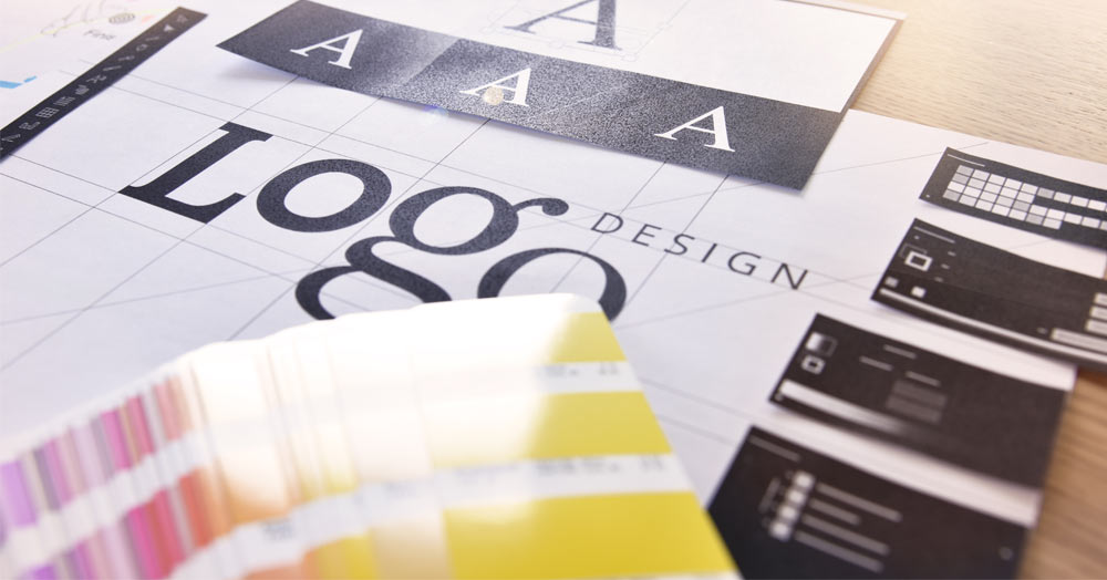
The Key Elements of a Political Logo
Political logos must be simple to be effective. That means you can’t get too cute with fancy effects or specific images. For the most part, political logos incorporate three main elements:
- Typography
- Color scheme
- Symbolism
You’ll have to make a series of choices about each of these elements. If you make the right decisions, you’ll be well on your way toward creating a great political logo.
Typography
In a logo, what you say isn’t nearly as important as how you say it. Most logos include just a few letters, either the candidate’s name or initials. The font you use for these letters will give the logo its general aesthetic. Non-serif fonts come across as bold and efficient, making them perfect for candidates making a no-nonsense appeal. Serif fonts are softer and gentler, and they’re generally best for campaigns built around human connections.
Color Scheme
The colors you choose for your logo will determine much of the image’s character. In general, it’s best to be relatively conservative with the color scheme. Bright shades and highlights might catch the eye, but they can also look cheap or cheesy. Red and blue are common for national campaigns, but they can become repetitive and make it harder to stand out. Ultimately, choosing the colors for your campaign will come down to a gut-level decision.
Symbolism
You can’t get too fancy within the limited space of a logo, but you should include at least one symbol that says something meaningful about your campaign. A star, an arrow, or a rising sun are neat, tidy, and easy to incorporate around the letters of your name. Whatever you go with, make sure it’s simple and doesn’t distract from the visual appeal of the overall image.
Examples of Successful Political Logos
Past political logos can provide inspiration as you design the visual elements of your current campaign. While copying components of other logos would almost certainly look lame, you can learn from past masters to get a sense of what works. Some of the biggest political figures in recent years have boasted especially appealing logos, and their excellent branding likely played a major part in their electoral success.
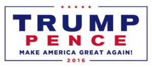 Donald Trump 2016
President Trump’s 2016 logo provides a perfect example of how a strong, simple font can send a powerful message. The image mainly consisted of the candidate’s last name, yet the writing was bold enough to become memorable. The thin box around the lettering was another expert touch, giving the image a solid structure.
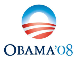 Barack Obama 2008
President Obama’s 2008 campaign perfected every element of the political logo. The simple “O” evoked the candidate’s unique last name without having to use extra letters. The colors were quintessentially patriotic, yet the lightness of the tones made them unique. The rising sun, meanwhile, served as a perfect symbol for the energy of the Obama campaign.
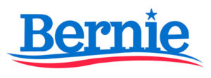 Bernie Sanders 2016
In his 2016 presidential campaign, Senator Sanders used a logo that was simultaneously bold and simple. The serif font evoked the candidate’s hopeful outlook, and the choice of text took advantage of his unique first name. The light-blue color set the logo apart, and the star above the “i” gave it a sufficiently patriotic feel.
Latest Political Logo Trends
There’s no single playbook for developing a fantastic logo. Ultimately, it’s on you to create the image that corresponds to the purpose and character of your campaign. No two candidates are alike, and a logo that’s perfect for one set of circumstances could be horrible for another.
With that being said, there are certain trends within the world of political logos that you should be paying attention to. You can’t rip off a logo in its entirety, but there’s nothing wrong with drawing on other designs for inspiration. If you keep these trends in mind, you’ll increase your chances of creating a logo that feels modern, stylish, and relevant.
Signature-Style Text
Many recent campaigns have used a signature font for some or all of the logo text. They’re generally more eye-catching than simple block text, and they seem to give the image more of a personal touch. You should be careful when employing this strategy to avoid creating a logo that’s too messy or hard to read. When done well, a signature-style logo can set you apart from the competition and win you an election. Done carelessly, however, a signature could make your logo hard to read and easy to forget.
Images Alongside Text
Many of today’s candidates are using a prominent image to go along with the text. This is a great way to make a logo memorable and recognizable. Just remember that you never want the image to be overbearing or distracting. Look for something simple that fits seamlessly around the letters of your name.
Boxes Around the Text and Images
Boxes are great for giving your logo definition and clear boundaries. They look strong, and they make the entire image appear tidy. Boxes are also particularly attractive on yard signs and political materials sent through the mail. Some candidates even use a slanted box, which is perfect for campaigns geared around youth or progress. A simple, straight box is best for candidates espousing firmness or conservative values.
Create a Brilliant Logo to Propel Your Campaign
Logos might not win or lose campaigns on their own, but they can have a major effect. A logo that sticks in people’s minds and effectively conveys the character of your campaign can give you a considerable leg up on the competition. People naturally associate images with ideas, and you want your logo to be linked with your campaign’s general arguments. By putting some time and effort into the project, you should be able to create a successful logo that has a positive effect on your candidacy.


