
Why (And How) Savvy Marketers Still Use Direct Mail in the Age of the Internet
July 31, 2021
Funnel Your Content Marketing Efforts in the Right Direction
August 4, 20214 Best Practices When Using Adobe InDesign

At first glance, you might feel a bit intimidated by Adobe InDesign. That’s certainly understandable considering the wide array of buttons and gadgets. However, keeping these tips in mind will help you leverage the power of InDesign to create print-ready pieces that will enhance your marketing efforts.
1. Begin at the End
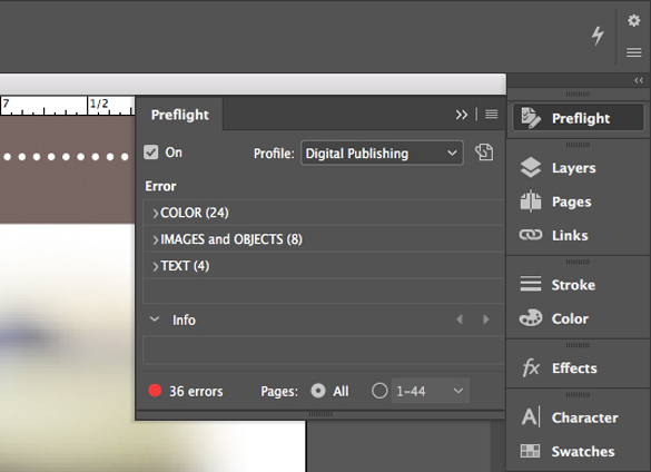 InDesign has a great feature called “Live Preflight.” This tool allows you to see many problems that your printer will find with the file before sending it. While designers traditionally would have to manually check their files for errors, or discover issues only after the output has been delivered for printing, Live Preflight helps catch things like missing fonts and images that are improperly linked.
2. Thread That Text!
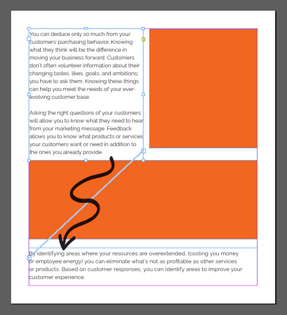 “Threading” your text allows you to flow content from frame to frame, making it much simpler to make changes to the size of text boxes and other page elements. Instead of being a bunch of disconnected paragraphs, this creates a more cohesive story that can evenly break across pages. Magazine designers use this powerful functionality often as they’re writing longer-form content, but it can be helpful even for smaller projects such as postcards or flyers, too.
3. Keep Your Formatting Consistent
 If you’re not careful, you may find that your fonts, sizing, and colors lack consistency throughout your printed piece. And it may be difficult to see this before sending it for printing. The best way to maintain that consistency is by creating styles for all your formatting. If you’re used to highlighting a block of text and applying a different font or color – break that habit! Creating styles that represent the aesthetic you’re trying to accomplish and then applying those styles to similar text blocks makes it easy to make global changes to text in the future.
4. One-Level High, Please
Stacking objects on top of one another may seem like an easy way to create advanced looks within your design, but this can cause some problems down the road. InDesign professionals know that stacking objects is sometimes required, but ideally should be avoided whenever possible to make it easier to shift items around on the page.
And if you have questions about your InDesign document, we’re here to help! Contact us today.


